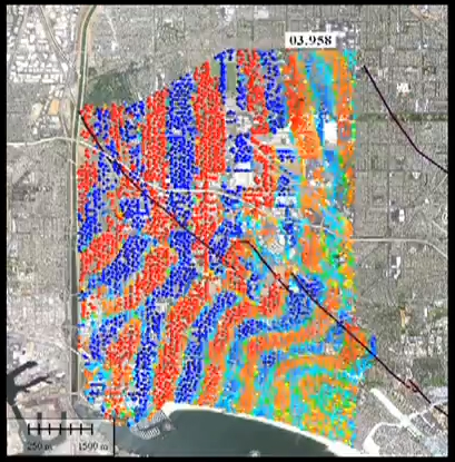
As the seismic waves from a whole host of little earthquakes in L.A. rippled through the basin in 2011, an astonishingly dense array of seismometers deployed in Long Beach captured them in unprecedented detail. Local oil and gas company Signal Hill Petroleum deployed the monitoring instruments in order to conduct an extremely detailed survey of the 3D rock structure beneath their oil fields. Researchers from Caltech and Berkeley struck an agreement with the oil company to share the data for academic research into the earthquake process and details of fault behavior. One of the results of this research is the amazing video below, in which we can see the elastic (seismic) waves of several earthquakes as they propagate from the hypocenter and rock the city block by block. Note that the initial playback is in real time, not sped up or slowed down. Skip around to see each of the 4 quakes without watching all 12 minutes: the individual quakes start at 0:45, 2:20, 6:00, and 8:35.
The seismometers of this network–in this case relatively inexpensive geophones, measuring vertical ground velocity–are located a mere 100 meters apart, creating a network with several instruments per city block! Because of this amazingly dense coverage, we can see the great gory detail of waves of motion moving through the rock underfoot.
In the videos, they have drawn the trace of the Newport-Inglewood Fault, a notable northwest striking strike-slip fault (the source of the 1933 Long Beach earthquake). One of the most notable features of the wavefields displayed in the videos is how drastically this fault zone alters the propagating waves.
Seismic waves from a nearby M2.5 earthquake ripple across the city of Long Beach in this visualization of an unprecedented dense array of seismometers.
When they travel along the fault, they speed up in the fault zone, likely due to alignment of mineral grains and rock structural boundaries in the direction of slip. When the waves have to cross the fault, they get held back and slowed down, forming an irregular jog or knick in the wavefield. This hold-up is probably partially due to that same alignment of grains, now traveling along their short axes, but it’s also due in part to “microslip” along the fault. As the rock on one side bends with elastic waves, the fault accommodates a bit of slip before letting the wave propagate past. The researchers are studying this effect as well, and have begun to map out regions of slip on the N-I fault during adjacent temblors.
It’s rather beautiful, really, to see that this mapped fault has a real physical effect, validating its presence and importance. It’s also endlessly fascinating to watch the details of real seismic wavespassing beneath the city of Long Beach. This is how the ground moves in an earthquake.
More info about the research coming out of this awesome data can be found here:
Update: If you’re now hooked on this kind of visualization, fret not: the Incorporated Research Institutions for Seismology produce these regularly using seismic data from the US Array. Though not at a block-by-block resolution, the animations come from impressive coverage on a spectacularly dense instrumental array, in which you can see the imperceptible seismic waves from distant earthquakes roll beneath the U.S.
The M9.0 Tohoku earthquake that roared through Japan on March 11, 2011 made its presence felt in various ways throughout the planet. The ground rippled, the ocean churned, and even the atmosphere undulated with heavy pressure waves as the force of this sudden lurch of the Earth’s crust radiated outward from its source off the coast of Japan.
[Put your headphones on now.]
Scientists all over the world have taken data of all stripes and turned them into illustrative visualizations–like the examples listed above–of the extent of this seismic event. Most of these are old news, but for some reason I thought of them today, so here they are for your illumination.
One of the most captivating effects of this earthquake–and of any–is the aftershock sequence it unleashed. Aftershocks represent the relief of intense local stresses left by the abrupt perturbation of a mainshock, and they unfold in a statistically predictable manner (there’s a fun presentation by USGS scientist Karen Felzer explaining the remarkable features of aftershock sequences here). Despite this statistical order, in our relatively fast-paced human timescale, we may still perceive them as startling and chaotic, especially when we’re on edge in the aftermath of a major quake. Sped-up animations of earthquake occurrence (“seismicity”) help illustrate the decay in frequency and size of aftershocks with time, as well as simply illustrating just how numerous they may be after a large mainshock.
This video shows one year of earthquakes greater than magnitude 4.5 around the globe. Many mainshock-aftershock sequences are apparent, but by far the most spectacular is the series of quakes that is induced by the gargantuan Tohoku earthquake. Enjoy.
This same group has produced several other videos, either covering different time spans, or zooming in to Japan. Have a look at their website:
One of my favorite videos of this flavor is the “sonification” of seismic records from the day of the quake, like the one at the beginning of this post. Earthquakes shake the ground at frequencies lower than human hearing (infrasonic), but if we simply speed up the playback of seismic records, and translate their motions into oscillation of a speaker cone, we get the “sound” of the earthquakes. In that “sonification” video you see seismograms from four different stations in Japan and Russia that record the mainshock and the onslaught of aftershocks–including a 7.9–that follow. The inset map shows energetic yellow glows surrounding each station that are scaled to reflect the amplitude of the seismic waves recorded there.
If those aren’t enough coolness for you, there’s a whole page of different “sonifications” compiled by a Georgia Tech researcher illustrating different phenomena associated with the monster quake. Several of the clips play regional recordings of the mainshock and its aftershocks, but the compilation continues into recordings from the other side of the planet, where seismometers in California recorded the San Andreas Fault creaking and shuffling with triggered tremor as the long slow elastic waves from Tohoku swept through.
A seismic record section and frequency spectrogram show the first hour following the Tohoku quake. Click the image for the movie with audio. Quicktime format. The link to other videos and formats is below.
If you’re into these sorts of things, there are more to be found… The California Integrated Seismic Network has some sped-up recordings of the 2004 M6.0 Parkfield earthquake and its aftershocks, at http://www.cisn.org/special/evt.04.09.28/sounds.html
I'm a Ph.D. student in earthquake geology, using topographic and stratigraphic investigation to unravel the seismic history and dynamic behavior of continental faults. I get excited about all things seismological, and I bring them to you here.


 Big quakes in the past week
